Get ready to find all that you need at the tip of your fingers!
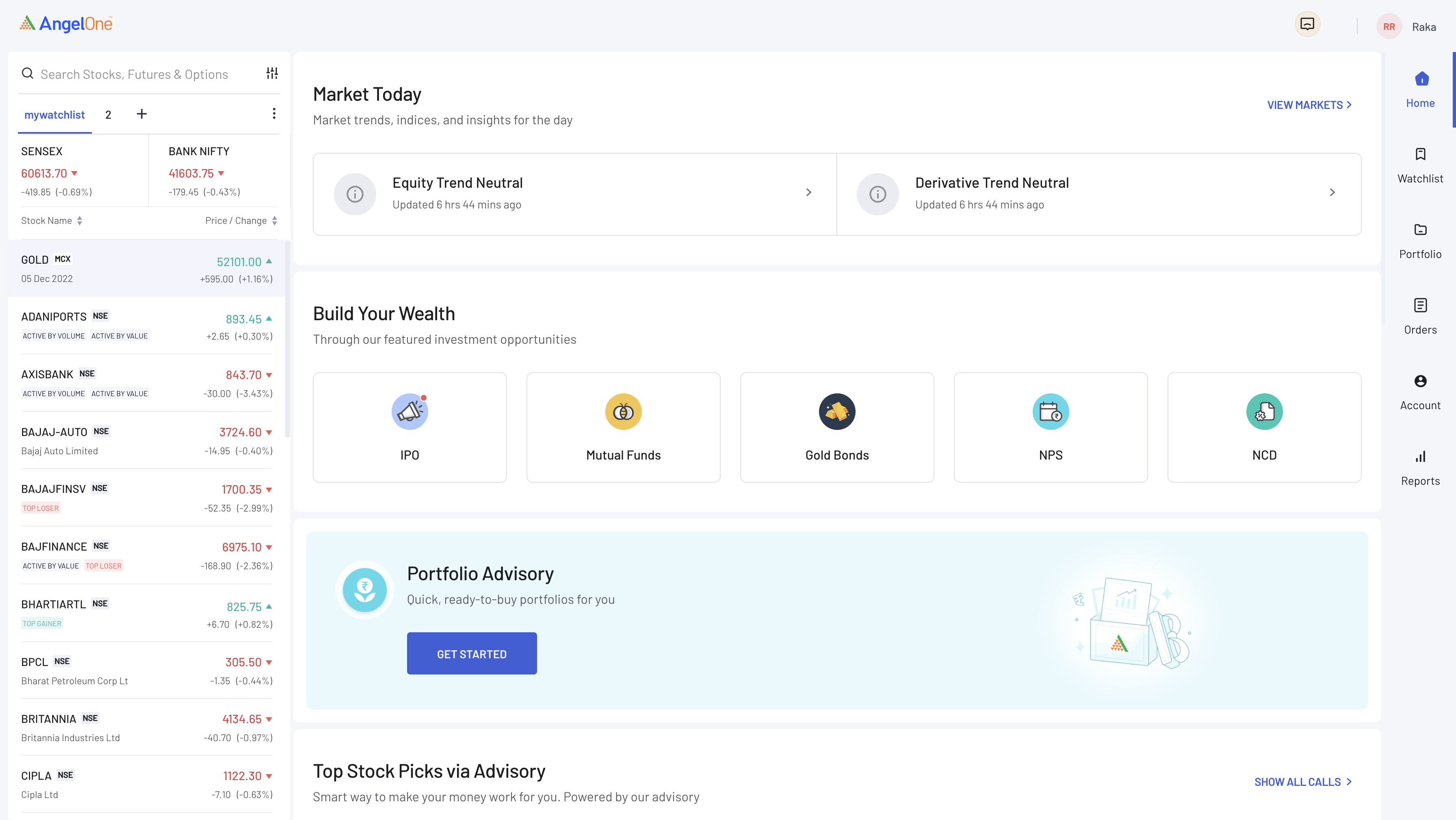
While creating the Home Page, we have kept the user experience of the everyday trader at the top of our mind. From updates on upcoming IPOs to buying stock SIPs, you are a click away from whatever you need.
The following are some of the top services that are placed right at the Home page itself for easier access
Feel interested already? Check it out!

Figure 1: The new Angel One Home Page
Now, your investments are even more secure. How?
Usually all you needed to do to login to Angel One’s trading platform was to use your Client ID and password. But now, we have enhanced your security –
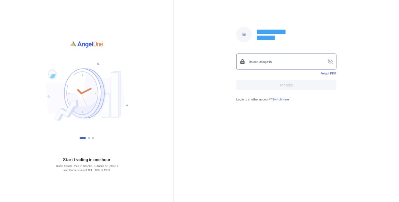
Angel One has rolled out a new 2-factor authentication system on the web platform. Now, you can login using your phone number > OTP > MPIN in a matter of seconds.
The new system is a step further is ensuring the safety and security of our users and is in compliance with the latest SEBI regulations.

Figure 2: The Angel One Login Page
In order to understand more about 2-factor authentication, click here.
Rationalised order journey with the right data at the right place!
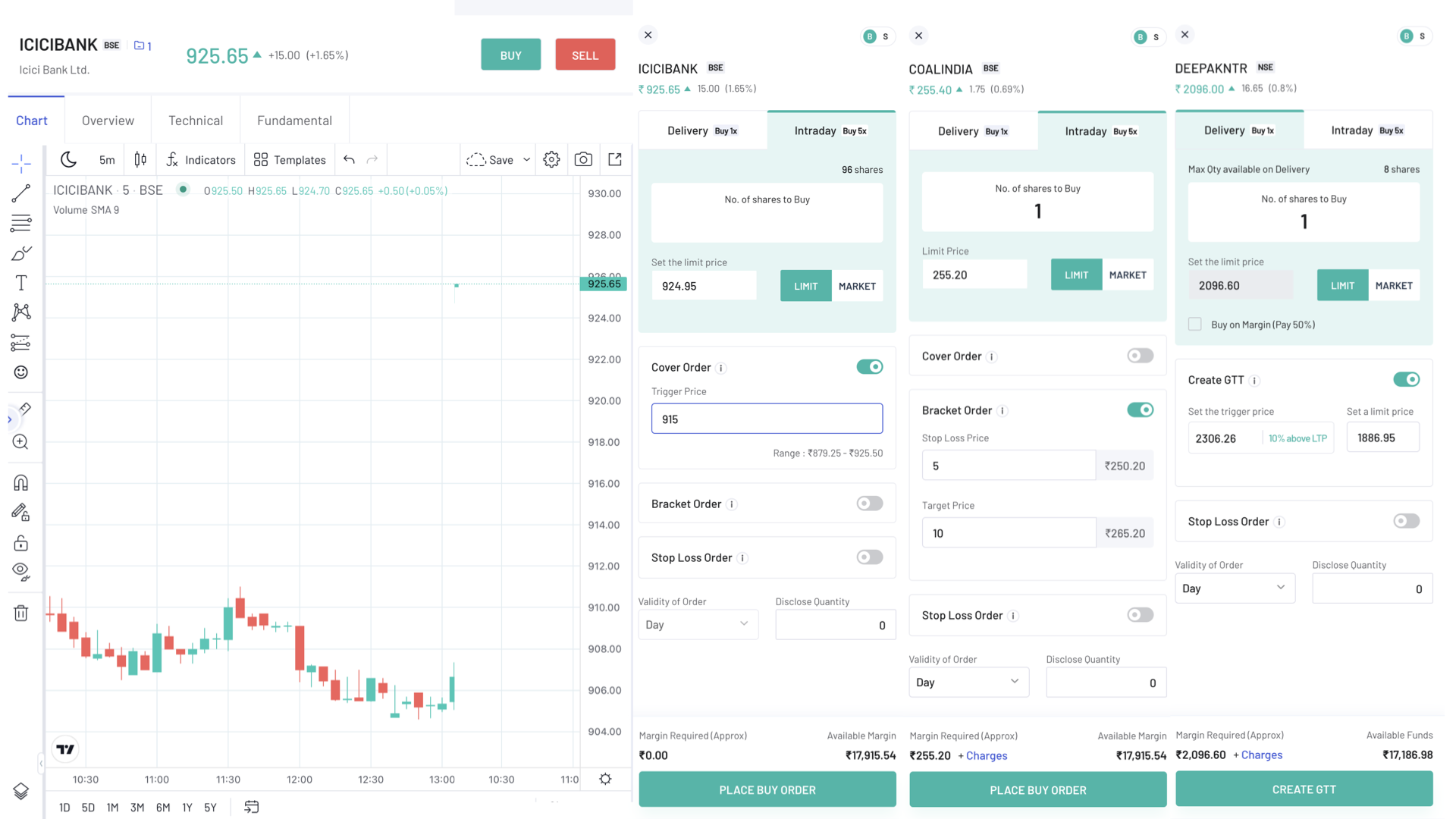
GTT, cover order, bracket order and more – all are now available in a single screen. This means no more extra clicks throughout the platform to place the order you want to. Just click on the stock you need, and et voila! You will have the option to choose your order then and there.

Figure 3: The sections for Cover order (left), Bracket Order (middle) and GTT (right)
We understand that while choosing a trade, you need the most important information (data, news etc.) to be present at the places in the order journey where they matter the most. Therefore the data points presented as well as the format that they were presented in were optimised to aid the user in making the best investment decisions.
Your trust is everything for us and we have decided to preserve it!
The most valuable asset of Angel One is the immense trust that millions of customers have placed on us over the years. Therefore we have adjusted the ‘My Account’ page to make it as transparent as possible – especially when it comes to making clear the various charges involved in transactions and their reasons.
Furthermore, adding and withdrawing funds is now made so much easier. Just visit your account and you have your options ready!

Figure 4: The ‘My Account’ page on the Angel One platform
We got so much packed for you that we just can’t stop.
Here are a few more goodies:
We know you love a simplified and efficient trading experience and that’s what awaits you on trade.angelone.in. So let’s not delay any further – login to the new version of the Angel One platform and start enjoying the benefits of a top notch trading portal today!
Published on: Nov 11, 2022, 2:47 PM IST
We're Live on WhatsApp! Join our channel for market insights & updates
